P7 - Integrate the scripted character with the storyline to create the final product
Comic Final by Jacob on Scribd
M3: You must manipulate the visual appeal of the comic to clarify meaning
self-evaluation
I believe that my final product suits the brief that was played out for me. I believe that the graphic novel has an enticing, interesting story and perhaps isn't the most expertly drawn but I think it has a distinctive art style and bold text bubbles that will be well received by those who read it. I made sure that my piece used the direct text from the script. I had to make no changes as I made sure that I wrote the script exactly how I wanted it to sound and I made sure that I submitted a grammatically correct and perfectly spelled script. As spelling mistakes and grammatical errors are confusing to the reader.
I think that my comic suits the target audience pretty well to be honest. The wording is not too simplified, however it also isn't incredibly complex this allows the 13 - 16 target audience to be able to feel as though they are reading something for adults, however it is still a light read and doesn't take a lot of mental capacity to consume. This is important in my eyes as I think that it would be limiting to make a product that people have to really think about reading. This is because most people read a comic for quick fun that takes them away from the real world, however if they have to think too hard about reading it, it won't be some quick fun, so they might choose to read a serious book in place. And this would drop potential sales.
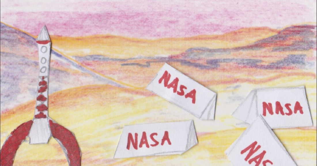
Personally I do not think that my drawing ability can compare with professionally drawn comics. Whilst for a small time comic I think that its distinctive nature works as a USP, a full time Graphic Novel could not get away with the monotone frames and repeated images. This however would be quite easy to fix. Simply by employing professional artists. Often artists have a hard time getting work and I think that paying them would make up for itself incredibly quickly as I believe that that would really drive sales up. I think that some things I would keep similar however. For example I think that the shot of the rocket ship on Mars surrounded by the NASA tents was one of the best images I made as I think that the obviously cartoony rocket ship really suits the genre and media type. I also think that there is a point of humour when you look at the canvas outdated military tent set up. Again like the lit cigar that I discussed in M2 (I think) It is logistically impossible to live on a tent on mars as you would need all sorts like temperature controls and an air supply. This adds to the light not so serious nature of the whole thing.
I believe that my final product suits the brief that was played out for me. I believe that the graphic novel has an enticing, interesting story and perhaps isn't the most expertly drawn but I think it has a distinctive art style and bold text bubbles that will be well received by those who read it. I made sure that my piece used the direct text from the script. I had to make no changes as I made sure that I wrote the script exactly how I wanted it to sound and I made sure that I submitted a grammatically correct and perfectly spelled script. As spelling mistakes and grammatical errors are confusing to the reader.
I think that my comic suits the target audience pretty well to be honest. The wording is not too simplified, however it also isn't incredibly complex this allows the 13 - 16 target audience to be able to feel as though they are reading something for adults, however it is still a light read and doesn't take a lot of mental capacity to consume. This is important in my eyes as I think that it would be limiting to make a product that people have to really think about reading. This is because most people read a comic for quick fun that takes them away from the real world, however if they have to think too hard about reading it, it won't be some quick fun, so they might choose to read a serious book in place. And this would drop potential sales.
Personally I do not think that my drawing ability can compare with professionally drawn comics. Whilst for a small time comic I think that its distinctive nature works as a USP, a full time Graphic Novel could not get away with the monotone frames and repeated images. This however would be quite easy to fix. Simply by employing professional artists. Often artists have a hard time getting work and I think that paying them would make up for itself incredibly quickly as I believe that that would really drive sales up. I think that some things I would keep similar however. For example I think that the shot of the rocket ship on Mars surrounded by the NASA tents was one of the best images I made as I think that the obviously cartoony rocket ship really suits the genre and media type. I also think that there is a point of humour when you look at the canvas outdated military tent set up. Again like the lit cigar that I discussed in M2 (I think) It is logistically impossible to live on a tent on mars as you would need all sorts like temperature controls and an air supply. This adds to the light not so serious nature of the whole thing.
Audience Feedback:
These are the questions I asked my audience about my graphic novel.
These are the questions I asked my audience about my graphic novel.
- Do you think the art style is suitable for the genre and media type?
- People were for the most part very positive about the art style. They did say that it didn't look especially professional to which I assured them that that is fine to say as "I do not think that my art skills are particularly developed". They said that aside from that however my art was suitable for a comic and they liked that fact that for the most part I had used tracings to create a more realistic looking art style as opposed to a cartoony style. They said that that "gives it a more serious feel" as opposed to a comedic Graphic Novel.
- Do you think that the story is sensible and original enough to prove popular?
- Most people felt that the story was original and could prove popular, the main problem that they brought up was that it might become limited to keep this going for a very long time as the storyline itself has a goal that is too close to where I ended the comic, as in either all the characters die, or they have a short amount of time before they can come home anyway. This could be fixed by rebooting the first edition and extending most scenes so that the characters needn't even be on Mars by the first Episode. Only one person picked up on the Forbidden Planet (1956) reference, but they said that whilst the storylines are similar they are also quite different and that it certainly isn't a copy of the film.
- Would you buy this comic if you were to see it in a store?
- The people who I interviewed were varied. Most said that actually it isn't their preferred genre and they don't tend to associate with media like that, however a few did say that if the cover was striking enough they would certainly give it a skim and they felt that if they did that they would have almost certainly been prepared to buy it on the off chance, especially as they thought that it could intrigue them. One interviewee however did say that they genre interests them and that actually it would be a very compelling sale and they would enjoy it if they did buy it.
- Are there any changes you would make?
- As with the first question that I asked people thought that the art style was slightly too amateurish in place. They often said that often the quality of filling in, for example on the title page, wasn't neat and that it was quite clear how I had drawn it. They did say that the hand drawn with pencil and paper aspect of the comic was however a good touch as "too many comics are done on a computer".
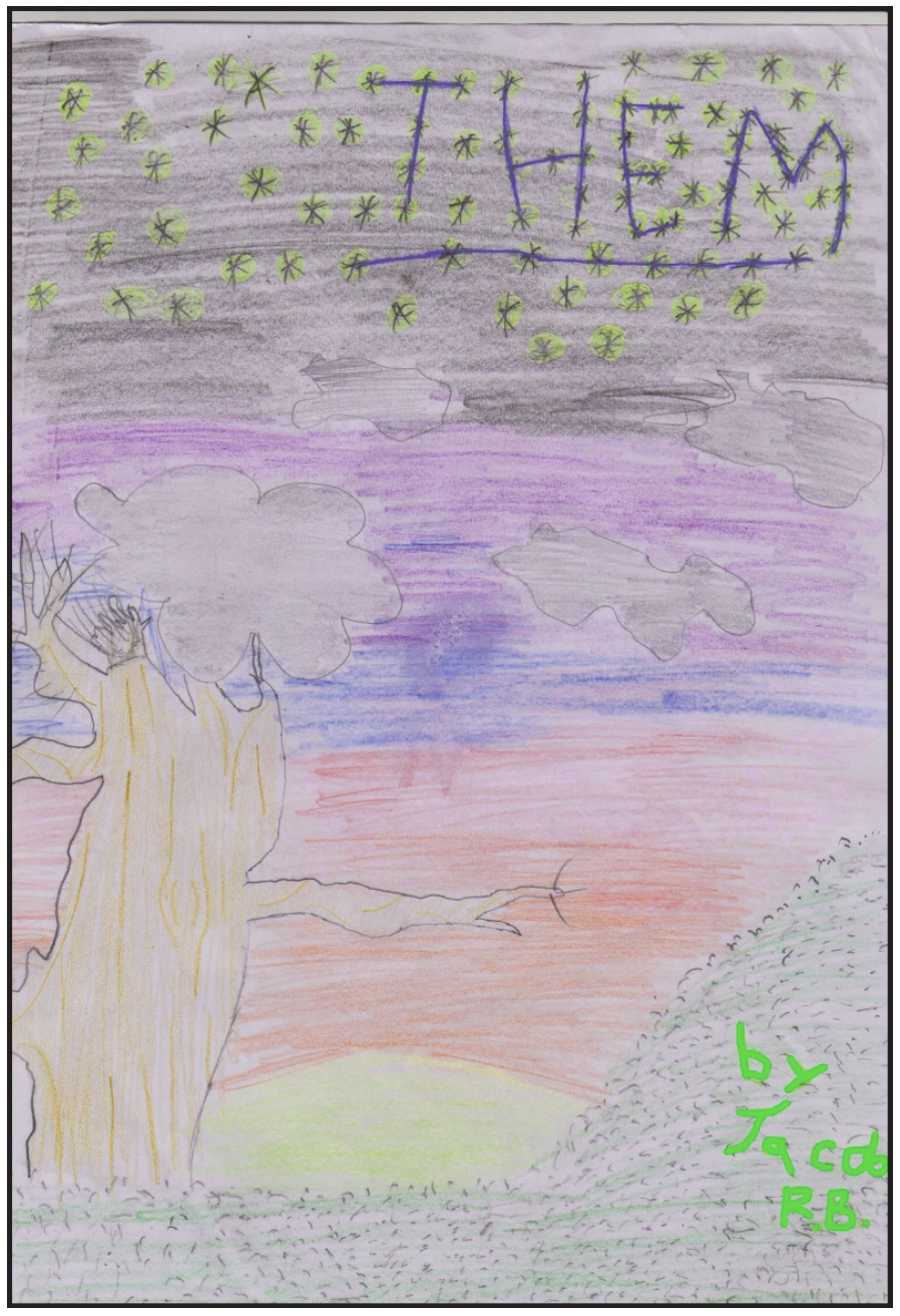
Here is the original title page.
|
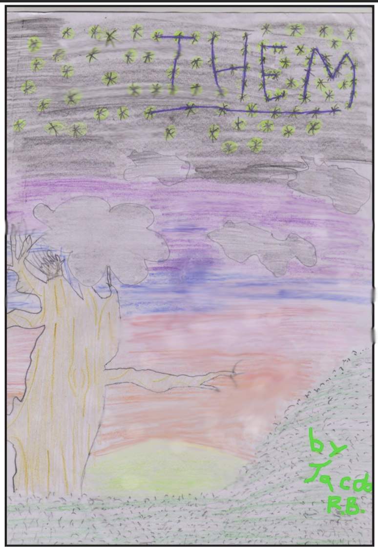
Here I have attempted to smooth out the harsh colouring using photoshop and whilst I think it is improved I think that I will not be able to improve it considerably.
|
D2 - Justify how the visual style of the final product follows the conventions of graphic novels or comics within its genre
Overall I have to admit I am impressed with the content that I have produced I think that it is quite professionally done and that it has an original edge and that it could go on sale and perhaps be niche but still be moderately successful. However I have written a full analysis of what I liked and what I thought wasn't so effective below...
Consideration of images used
I draw all of my frames by hand, or occasionally I layered images physically and then scanned them, but I will write more about that later. To create my frames I took stock photos from the internet and then traced the basic shapes before filling in details such as facial expression and background key data. This was because I wanted to create a professional looking piece of work that had a degree of realism to it. I found that this style worked quite well and I would certainly do this again if I had to create another graphic novel. I might even take photos of people in specific poses so that I have full control of how the image looks.
As I started to say, occasionally I actually made cut outs of specific Items and then placed them over predawn scenes and then scanned the whole image. This I think worked very well. I did this for most of the long shots of Mars as I did not want to have to redraw the same scene identically many times. I think overall that worked incredibly well except for one slight blip where on one of the scenes, one of the tents is slightly raised and you can see a slight shadow behind it. This is not a huge issue however and I think most people would not notice unless it was pointed out
Overall I think that the slightly unique style is very well suited to what I made, I think it has great potential and will certainly stick out in peoples minds. I think that it gives a good sense of emotion and would prove to be a great selling point.
Panel layout
For the most part my panel layout was very standard, I mostly tried to conform to a 2x6 panel setup however this didn't work for everything especially when there were large landscape scenes or scenes where the rocket was present as that needed a larger frame to cope with the sense of scale. I think that it meets industry standard and is very professional.
Story flow
The story flow I think is very powerful, I think that it is an enjoyable story and should prove to be a very good seller. Personally I feel as though it has a lot going for it. There is a lot of tension that should keep the reader hooked and wanting to read more. The next thing that I think is an effective aspect of the story is the sci-fi element. Sci-fi is a strange genre in that typically either you are into it and you love it or you simply don't like it, it is rare that people are on the fence with it. That interests me and as someone with a penchant for science fiction I believe that the story has enough that science fiction lovers look for in a story. There is outer space, mixed with unstable new technology, a real sense of adventure, aliens and something that seems present in every science fiction story which is where a good situation turns very bad and a small group of people have to take this on as a personal challenge or else they will die.
I think that even after completing the whole thing there is nothing that I would change about any of the story.
|
Colouring of characters and environment
I did not colour in a conventional manner. I often opted for a less coloured approach with plenty of black and white scenes. This was not without reason, I wanted there to be a distinction between the explorers and the place that they are exploring for example on the frame to the left you can see how I made the tents and rockets, i.e the human items in stark white whilst the surface of the planet is coloured in full. This is because I want to make it clear that these people are making an impact on a separate planet. And that this isn't necessarily the monster being evil. But is it just protecting itself? Would we as a civilisation kill aliens that they to invade? This is not a large part of the story but it was around halfway through creating this comic and creating an "evil monster" that I realised what a self centred opinion most of this genre holds. I soon decided that this wasn't fair and I tried to look at it from another perspective. |
Narrative perspective
The narrative perspective is fairly conventional. I chose to primarily follow one character, this being D.Wayne. Most of the actual dialogue is held by D.Wayne and there are plenty of close ups of his face. This is fairly conventional of the genre and of the media type. Where most graphic novels and most adventure style stories will have a focus on a singular character and his interactions with other characters. Take an Indiana Jones film for example, he will always have a side kick and usually some enemies (predominantly Nazi), yet overall the focus is on what he does and what happens to him as he looks for some kind of artefact.
The narrative perspective is fairly conventional. I chose to primarily follow one character, this being D.Wayne. Most of the actual dialogue is held by D.Wayne and there are plenty of close ups of his face. This is fairly conventional of the genre and of the media type. Where most graphic novels and most adventure style stories will have a focus on a singular character and his interactions with other characters. Take an Indiana Jones film for example, he will always have a side kick and usually some enemies (predominantly Nazi), yet overall the focus is on what he does and what happens to him as he looks for some kind of artefact.
